Thursday, 22 September 2016

warts and all

After my last blog post, where I shared a page from my sketchbook, I received so many warm and enthusiastic comments.  I began to think that this might work as a regular feature on my blog - a place where I periodically share a recent page and show the tiles that emerged from it.  Inevitably it takes a few weeks from me starting a page (and dating it) to filling it and then only later the ideas and trials filter through to finish tiles.

And so, let me take you back to mid August, when I began this page -


You can see a little cluster of practice gems in the corner - these eventually made it onto the Zendala I shared in my last post.  Sometimes ideas from more than one page have to learn to work together!  I'm relatively new to gems and didn't get off to a great start when in haste I grabbed a chalk marker instead of a blender - hence the dull milky look to a few of them!


You can see my Drogon practice which went onto a tile for an Olympic themed It's a String Thing challenge.  A little burst of Jenna Black's Starcrossed got repeated several times on a very warm looking tile.  And that strange fusion of A-dalfa and Viaduct become the start of a tile that I will send to someone else on the Travelling Tangles Project (I've started to accumulate a little stack of pre-prepared tiles so I have some to hand any time I need to send one, or more).


And then things started to get really dark!  I had a tile that didn't work out - a while back I'd tried to prepare a background that vaguely resembled the Aurora Borealis - but it looked a mess.  So onto the pending pile it went.  But then I spotted it and thought I'd have a go using the very spikey 3V.  I darkened some sections, and filled others with Baton and an alternative version of Hypnotic that's been doing the rounds (and that featured on the sketchbook page before this one!).  It's a crazy tile but I like it for that!


Another beast that rose from the darkest depths is this Trelina (a tangle by Eni Oken) climbing through the A-dalfa frame.  The background was one of my first attempts at using distress inks.  I also did some coloured shading and also threw in some bubbles and white highlights.  And you have to take my word for the fact it looks much better in real life - the scanner doesn't like the deep colours.

There are a few other little scraps of this and that on the page that didn't make it onto a tile, but you never know, they might do soon...


Wednesday, 17 August 2016

anatomy of an idea

This week's Square One Facebook group focus tangle is the lovely Oke by Michele Beauchamp.


I started playing with this tangle in my sketchbook (you can see it in the bottom left corner of this very cluttered / inspired page) and soon stumbled on an idea I liked.  I'm a little scared showing a full on sketchbook page in a public place - it feels a bit like having one's underwear on show!  But I thought it might be interesting, so you can see how bits of ideas that begin randomly, or jump from one tangle to the next, come together into one piece.

I tangled a quarter circle version in the basic beauty of black and white to meet the group posting criteria.


But I felt there was a bit further I could go so set to work on a Zendala using the same kind of design, with a few added feathery type Fescu and some flourishes.

There are few rare things happening on this tile - for one I rarely use these beautiful but precious official tiles.  Seconding I rarely draw gems, but this tile called for them, and I used not one but seven!  I also took longer that usual on this tile, coming back to it over the course of a couple of days.


It was a joy to draw and I'm very pleased with the final result.  We are having a few days of bright and sunny summer weather here, but by the looks of this tile my heart is already half way to autumn.

Wednesday, 10 August 2016

going with the flow

This was one of those tangling occasions where I set off with no direction in mind, no plan as to what might end up on the tile. 


It began as a test to see whether there was a compatibility problem with using my fine line pens over some new watercolours.  I'd had some clogging problems when practicing, but think maybe I hadn't let the paint dry completely (I can tend to impatience!).  The pens still complain a little over areas that include hints of the metallic paint - a bit of silver in this case - but not enough to even have to clean the nib.  I was also trialing a newer smoother (and cheaper than my usual) watercolour paper - and apart from a slight wrinkling it did well.  So equipment wise it was a success. 


But even more satisfying was the look of the tile.  It began as simple wash of a fairly bright green, with a few blue streaks and some silver on top.  As I began tangling some Diva Dance I felt that was all that should be on the tile, with a few added Orbs.  Very minimal shading but a bit of coloured pencil to accent the Orbs.  And there you have it.  Very relaxing to do and the pleasure shines through in the piece I think.

Monday, 25 July 2016

catch 'em if you can

Last week I launched my Leftovers Project - an ongoing aim to use up those left-on-the-pile tiles.


This week's Diva Challenge gives me the perfect oppurtunity to grab another and use it.  This tile has been on the heap for a long time - in fact I've got a sneaking suspicion I probably drew the string for a previous circle based Diva challenge...

I filled the varying sized circles with a new variation of N'Zeppel that appeared in my sketchbook yesterday, as well as a couple of other tangles I've used lately and still have their hooks in my mind (Cat-kin and Crescent Moon).  I added colour using some new paints - that I clearly need to practice with more, because they came out a fair bit more intense than I expected.  Some stippling softened the surround.


I like the finished tile - it reminds me of thought bubbles drifting by - some calm, some complex, none likely to last long.

Tuesday, 19 July 2016

waste not, want not

I dislike waste in all areas of life.  I clear my plate every night, take care to not buy more than I need, and recycle or donate anything I no longer want that still has a little life in it.

And of course I don't throw away tiles that have 'gone wrong'.  Instead I tuck them into the little basket where a handful of fresh blank tiles live and hope to come back to them one day.  But I rarely do.  The stack just builds up.


There's all sorts of tiles in there.  Ones that I started and then lost my way, lost my faith.  One that are nothing more than a string.  Experiments in colour that then overwhelmed me when it came to placing a line on them.  And some that are almost finished and then fell at the final hurdle.  Misshapes, mistakes, misfits.

I've been muttering to myself about doing something with them for a long time.  So, now is the time.  To launch a sometimes project to give a new lease of life to those unloved tiles.  Starting with this one...


 ... a couple of blobs, squiggles and a spray of blue on a cream tile.  With no fixed plan I tangled a large section of Arukas, Papermint in one blob, Crescent Moon in the other.  Some creeping auras and then some Wool (with fills of Msst and Tipple).  I then shaded with graphite and a slightly dubious choice of two coloured pencils which I'm trying hard not to regret!
 

Tuesday, 12 July 2016

playing catch up

I didn't get myself together in time to send a tile for last week's It's a String Thing challenge.  So I had a play in my sketchbook over the weekend - and that extra paper space allowed me to squeeze in some of Adele's new tangle too!  O is a fun and easy tangle to draw - methodical, calming and it really jumps off the page once you shade it!  It worked well alongside Lenche as it almost looks like pins with their ends missing!


It's funny, but with so many new and beautiful tangles appearing every week - both those newly released and newly discovered - it's so easy to forget to use the tangles I created.  I can't remember the last time I used Kitl - and I had fun playing with it again.  Perhaps I won't leave it so long next time.

Tuesday, 5 July 2016

back to the future

Sometimes the wonderful world of Zentangle leaves me feeling a little spoiled for choice - so many tangles, infinite combinations, strings, black on white, white on black, tan, and colour, colour, colour.  New techniques, pens, pencils, paints.  Not to mention a wild array of challenges and inspirations from a multitude of other tanglers.  It's easy to want to do it all - and then somehow lose out on the pleasure of a deeper immersion into just one part.
My first Renaissance tile -
tangled with MA-XIII (Chantal Florin)

Tangled with Endless (Silke Wagner)
As soon as Rick and Maria introduced the idea of Renaissance tangling with its unique and warm glow I was drawn to it.  But I forced myself to put it down.  Put it away, even as an idea, for the future.  So other than occasionally working in black and white on a square of kraft card I haven't dabbled.  But I felt ready...


Featuring Pavonia (Angie Shade)
plus Fescu and Tipple
And I decided to start with the sort of reverence that a style based on a long heritage of art deserved.  I took time to choose and source my materials.  I had a sample official Renaissance tile to look at - but it's hard to buy official supplies in the UK (although I notice that Amazon are now selling small packs of the black and white tiles!) - and if possible I like to source locally to minimize overseas shipping.  But that little tan tile is a shade onto itself, and despite pulling together every remotely tan-ish paper I had to hand nothing was quite perfect.

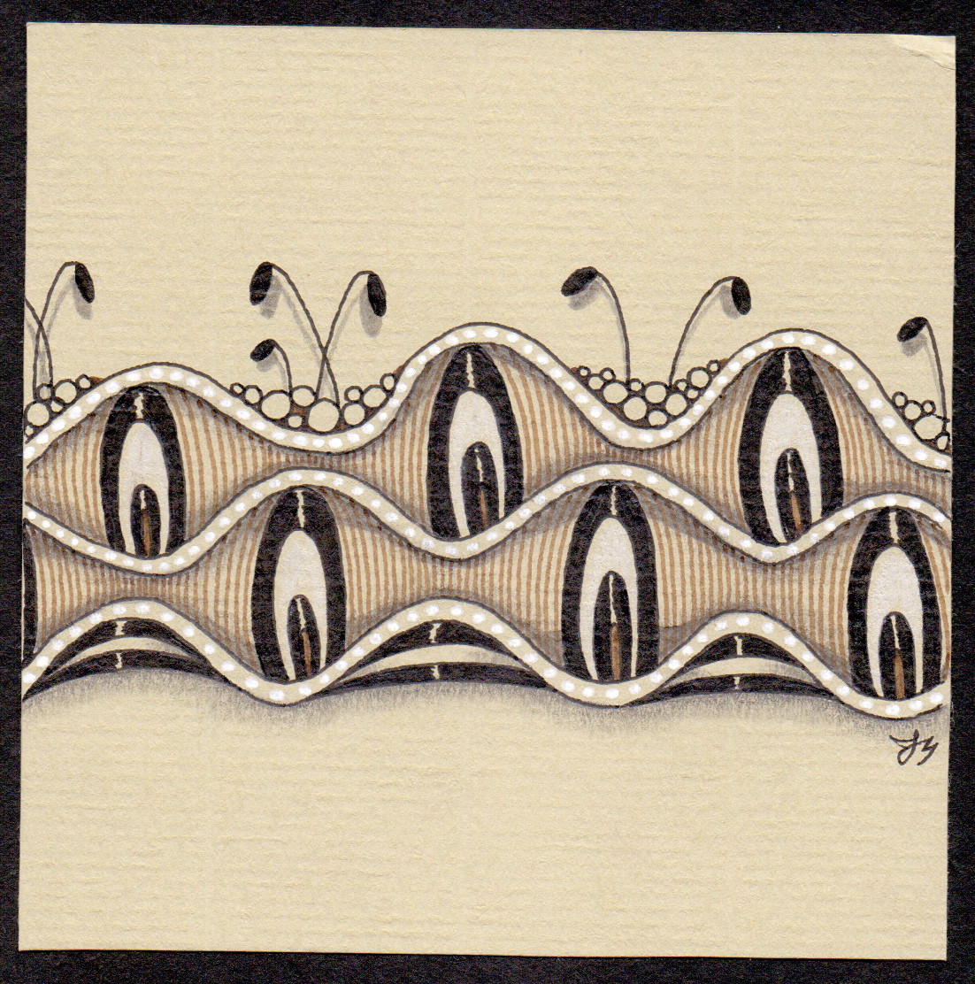
The closest match was a piece of Daler-Rowney Murano pastel paper in a shade called Stone - it's a lovely colour, and the brown ink and white highlights shine, but it's a little colder than the true tan tile.  But it allowed me to take my first tentative step !

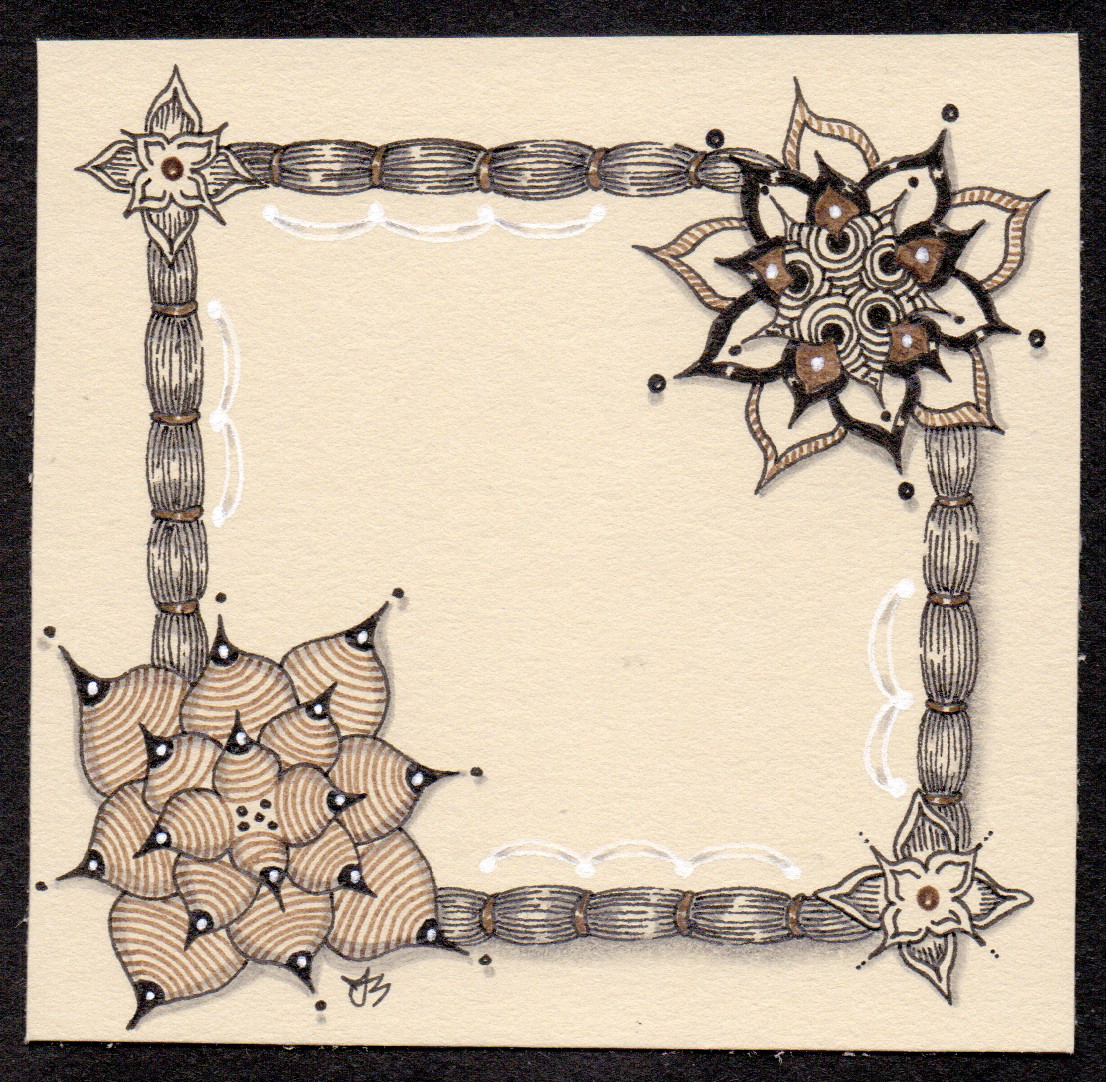
Keeping it official -
Cyme tied together with some Zander
Further exploration online, and with some welcome advice from wonder-tangler Lily Moon, I got hold of some Fabriano Ingres paper, in the shade Gialletto.  With a slight tweak in the spelling I got a translation site to explain that Gialetto in English means 'already read' - which makes me think the colour name is referring to that appearance that old and well loved books develop.  The paper is a good match, and the lines laid into it add a lovely texture to work over.  My next two tiles were drawn on this paper.  

My last experiment was on some Stonehenge 100% cotton paper in a shade called Fawn.  This is a very soft and smooth paper, it almost feels buttery, and it encourages me to really slow down.  Which suits the Renaissance mood.  I feel it asks for different things from me, less filling of the tile perhaps, slower and lighter pen work.  Patience.  And thoughtful glances ahead to consider where my white highlights might appear.  I enjoy the process enormously, and while I still feel most at home in the bold world of black and white this is like spending time in a favourite library.  It's peaceful, it's recuperative.  The light is low, the mood is easy - hours could be lost, but never regretted.