Friday, 22 December 2017

farewell for now

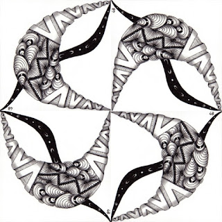
It's time for my last post for the year.  I've been to all sorts of places tanglewise this year - plenty of new adventures and old favourites.  And what better way to end than a fusion of the two.

This tile has been sitting quietly on my Leftovers Pile since Adele's 95th String Thing Challenge - way back in the summer of 2015.  Who knows why I got no further than I did.  Who knows what waylaid or distracted me or stole my time.

Forgotten but not gone

But the hint of the frame that I'd started to draw on that square of repurposed packaging seemed a perfect place to lay a section of new official tangle Rumpus.  A touch of festive colours, a touch of white chalk, some graphite and a few dots of silver paint and there it is.

This one asked to be viewed at an angle!

Summer meets winter, old meets new, forgotten meets newly found.  As this year nudges up to the next thanks for sharing it with me, and until the next one, take care.

Monday, 20 November 2017

burning bright

I'm finding myself increasingly drawn to working on series of tiles.  There is something both comforting and inspiring about having a fix set of variables - pen, paper, colours - and then nothing but the tangles need to change.  I find that limiting choices makes me more inventive.

I've done this a couple of times before - working in grey, honey and green - but this time I grabbed a frightfully bright orange paper and wondered if I could tame it into elegance.

Orange pastel paper / black ink / white gel / white pencil / pale green brush pen / graphite

And I think I did.  The subtle hints of green help to break up the orange.  And then of course I dabbled with the new official technique of Tranzending.  To be honest I wasn't too sure I liked the look of it when I first saw it.  It looked like a way to 'mess up' an otherwise appealing tile.  But then I played about, adding a little hint here and there and it started to make more sense.  As you can see through the course of these 4 tiles I got more adventurous, using a larger and more complicated section of Tranzending each time.  It takes a bit of thought in my mind, to work out how it can be brought in to compliment rather than obscure what's already there.  But I think it's an interesting way to add another dimension to our tiles.

Thursday, 16 November 2017

all the leaves are brown

This week the Diva asked us to work big. For me one of the joys of Zentangle is its small size, but I thought I'd allow myself to grow at least a centimetre here, a millimetre there.

I worked on a piece of khadi paper - a rather uneven surface but a pleasant change to work a rectangle rather than a square. This piece measures 11 x 16 cm. I decided to work all in colour, using Faber Castell Pitt Pens in sepia, sanguine and orange. I used two sizes, a 0.3mm and a jumbo 0.7mm!

I expected to find that the thicker pens felt uncontrollable, but in some ways they were more manageable, and less liable to show my wobbles, especially on the bumpy paper.


I had a moment when I'd finished the three stems of Aloha when I wanted to stop, leave the paper with nothing but this delicious minimalism. And perhaps I'll revisit this design, and stop a little sooner, but for now I carried on.

I added an orange Printemps background, which I then coloured over with Distress Ink (Frayed Burlap). Some shading with sympathetic coloured pencils and graphite, a few white highlights and there it is.   True to the rules of Zentangle I turned it round once I'd finished, to view from all directions and far preferred it upside down!


A snapshot of autumn. The last leaves are still clinging to our trees, maybe later than usual this year, but one committed wind and they'll be gone.

Saturday, 28 October 2017

half way between here and there

I haven't tangled much of late.  I've been busy with other things - mostly a 6 week creative writing course that I'm coming to the end of.  I've loved it, but I've missed the other things I love too, including and especially tangling!

I'm having a couple of weeks downtime starting now, but after that I hope to be back with more regular posts.  I have plans to play with a few tangled ideas during my downtime. 

Tangles used - Vega / Mooka / sort of Fescu

But before I go.  A farewell-for-now tile that I made this morning, prompted by the Diva's invitation to try white on black.  I find it so hard to make something that I'm happy with, but I'm persevering, and every time it gets a little bit better.  I think the thickness of the white gel pen after the Micron is the shock, so I'm very much looking forward to these thinner Gelly Rolls hitting the UK shores - no sign of them just yet...

Friday, 8 September 2017

I don't know why I dream this way

Today I want to introduce you to my latest tangle.  It's been haunting me for quite a while, popping up in bits and pieces on many of my tiles.

You can see - bands of it running through my twisted rope string tile -
it edges Batumber on my grey tile - I use it to create a simple but
favoured fill for Dreamcatcher, and it was the perfect choice to finish
a Travelling Tangle sent to me by Elena Greer

For a long time I thought it wasn't really enough in itself to class as a tangle.  It has so many tangle-relatives, which it shares less or more characteristics with.  To mind come Isochor, Indyrella, Barberpole, Marasu, Sugarcane, Starcrossed, Ticking and Kristillis - I'm sure you can think of more?  All of these tangles particularly appeal to me, and all rely on those repeated curved lines for detail.  But each has a particular initial shape which defines it and the detail lines are almost an afterthought.  I wondered what would happen if the lines became the star of the show, and the structure merely the framework to hold them...

And so Clob was born.  Clob because the little lines work best for me when I draw them as I would a CLOsed Bracket!  Of course the name might not suit you if you prefer to draw open brackets instead!


I find the repetition of the Clob line so relaxing.  Shading is so simple - you just pop a line of pencil into the valleys and smooth it out a bit, making it as dark or light as you like.  And suddenly the tangle is transformed - it really seems to shine, and jump out from the paper.


There are so many variations possible, depending on how you lay your initial lines.  Parallel or not, straight or curving or spiral, closer together, far apart, laid over each other, or with gaps between.  You can even embellish within the little brackets.  And of course it plays well with other tangles.

White on black - always the trickiest combination for me. 
Clob accompanied by Flux.


Renaissance tangling - Clob dances with Henna Drum and Cat-Kin.

Call it washed-out or call it dreamy?  Blue and purple tones
give a soft look to Clob with big bright Printemps.

Last but not least the simple elegance of black and white.
  Abukas with bands of Clob and a handful of Fescu.

Perhaps by now you can see why I think those little shiny lines deserve a tangle and a name all to themselves?    I hope you have fun playing with Clob and I'd love, as always, to see your results.

[Hopefully this pattern doesn't replicate any existing tangle I might have missed, in name or appearance, but please let me know if it does.]

Wednesday, 30 August 2017

stones in my pockets

Much of my recent tangling has taken place within a journal, thanks to being caught up in the Tangled and Journaled Facebook group and their Little Summer Project.  I've enjoyed following the prompts and working within a journal has been a new, challenging and only infrequently frustrating process.  That particular project has come to an end, so I'm looking forward to getting back to work on some loose tiles.

The first of which was a tile for this week's Diva prompt - a guest post by Jane Reiter who invites us to tangle with the wonder of Petoskey stones held in mind.  I did, but perhaps they rattled around a bit too much, because their influence was a little lost by the end!  I pencilled a light hexagonal grid and then added a 6 sectioned variation of Moonpie.

Coloured pastel paper / sepia Micron pen /
brown, white and graphie pencil shading

Until I have something more current to share with you, I'll offer you a set of green tiles I finished a couple of months ago - companion pieces to the grey and honey tiles I posted way back in May.

Green pastel paper / green Copic ink / green Inktense pencil / white pencil and gel pen / graphite


I've also had the thrill of being involved in another Mosaik Project - where I sent this tile to Annette -


which she then turned into wonders like this -


only far more fabulous as her mosaics also involved the work of 28 other tanglers.  Follow the button to see the results and go on, join in with the next one when it is announced at the end of October!

Thursday, 13 July 2017

enjoy the silence

I've found time to tangle of late, but not always to share what I made.  So, in a break from my usual routine, this post will be mostly pictures, few words.

Jessica Davies is guest hosting the Diva Challenge this week -
and she asked us to use a heart string.  I'm not partial to hearts, but am smitten
with Jenna Black's Cross-UR-Heart - so all came good on this tan tile.


We've had a couple of spikes of unseasonably hot weather recently - one in June, one last week. 
On both occasions I tangled onto a tile dyed with tissue paper.


As the temperatures fell, clouds gathered and the rain began.  I tangled this
for It's a String Thing #202 - but ran out of time to send it to Adele!


And lastly, but not leastly - my tanglefriend Michele is guest hosting
Joey's challenge this week.  She asked us to use Margaret Bremner's
rope string and step away from anything other than the tangles we held in mind.
  Which left me with Printemps, Beadline and those shiny lines
I can't resist drawing everywhere!


Thursday, 29 June 2017

a little uncanny

Not much time to tangle this week - but how could I resist the Diva's invitation to play with Aquafleur

I took a rather yucky yellow tile and went all angular on it - inspired by Rick's Aquafleur triangle and the Aquafleur with a hollow middle on Shelley Beauch's blog this week.  I also popped in a few Deco-style fillers which I've been playing around with all week.


As I was tangling my partner was busy in our kitchen, baking a surprise cake for my birthday tomorrow.  When we'd both finished our makings I went through and she revealed the cake to me - lemon and poppyseed.  I had no idea what she was planning and she had no idea what I was tangling - but if ever a cake and a tile could match, these surely do!

Thursday, 15 June 2017

breaking the rules

Anything that encourages me to slow down and take my time is a good thing - so meeting Margaret Bremner's Dansk tangle via this week's Diva Challenge was most welcome.

Margaret suggests we don't start with too many individual Dansk sections - but it's always tempting to want more, more, more of a pleasing tangle.  I kept my numbers fairly limited in this first tile drawn onto a background I'd coloured using Distress Inks. 


There was no additional colour added - just graphite and a little white pencil for highlights.  It's tempting to shade with more colour but sometimes I like to stick the muted tones of the background alone. As the Dansk grew bigger, it was easier for my auras to grow a little wobbly, but I just about managed to tame them.  This reminds me of 70's wall paper, of peacocks, of coffee drunk at dusk.

I had another go with Dansk on an original Zentangle tile.  The tooth of the paper made my line slower and short tails on the Dansk also meant the auras were more manageable.  I couldn't resist squeezing in more this time and I changed the tangle a bit by interweaving the auras too.  I built up the graphite shading layer by layer to add a sense of roundness to the two panels. 


I like the way my eye plays with what I'm seeing - am I looking through white bars to the scene beyond - stylized waves on a stormy sea.  Or am I about to reach out and touch two ornate tubes, perhaps part of a strange engraved musical instrument?  Zentangle is not meant to look like anything in particular, but my mind can't help but make up stories to explain the things my pen has done.

Wednesday, 7 June 2017

hello darkness, my old friend


Sometimes I wonder if the tangles I chose to use and the colours I select on any given day bear relation to what's on my mind, or what's going on in the world.  Maybe not, but I can't rule it out.  As the UK election pounds toward its conclusion my sense of hope tinged with doom casts a shadow over everything I do.  And so I find myself making heavy use of black in recent tiles.  None more so than on these two.

I selected a couple of tiles from my Leftovers pile. A striped green one that I did very early on in my dabblings with colour - I've often been drawn to the colours but found the strong stripes off putting.  But breaking them up with some dark curls showcasing a variation of Papermint that Sandy Hunter recently shared on Facebook really did the trick.  I was tempted to leave the centre section empty and then changed my mind and popped in another Sandy tangle - a nameless one I admired on one of her blog posts.      


I feel a sense of hope when I look at this tile - it's like I'm peering through vines and ferns in a magical forest and the green of livingness is so vivid I feel I could taste it, and there just ahead is a sparkling curtain of water droplets, perhaps a waterfall, perhaps just a tree shaking off the recent rain.

Things took a darker turn with the second tile.  This crazed background I made a while ago while testing out my Brusho powders.  They have a certain charm but are hard to tame - perhaps better to let them do their thing and then work with them rather than against.  I saw crushed berries and bruises before I began, but perhaps the influence of the Dracula television series we are currently watching seeped in because this is what happened when I added three sections of 2V (recently shared on Tanglepatterns).

2V is a great tangle, striking for it's ability to look great even without shading.  But it's one that, for me at least, needs a lot of concentration not to make a mistake on.  The section on the left went very well, with only a tiny error, but when I started on the one on the right it all started to fall apart, when I made a few wrong connections and divided a couple of my sections into too small a triangles!  It looks like it's collapsing, unable to hold itself with the elegance of the section on the left.  But I think we all have days when we feel like that!  

There's an undeniable darkness to this tile - I imagine myself in a desecrated church, staring up at the stained glass windows and wondering how much longer they will hold themselves together.  I also picture bloody pennants hung from the ramparts of victor's castles.  And while it's felt tooth and nail at times lately, thankfully we don't decide our leaders on the battlefield these days!

Wednesday, 31 May 2017

two become one

This week the Diva challenged us to draw a diptych. I'd seen a few of these floating about over the years, but I had no idea how much fun I'd have making my own.

Just before I started on the tile I'd been shopping for a gift to give to my Dad on the upcoming Father's Day. Always a practical man he's getting a new hedge trimmer! His ability to fix almost anything and his never-ending supply of tools must have been lodged in my mind as I drew a very sensible looking hinge to join my two panels.


The panels themselves spring to life with borders of the lovely Trella tangle by Adele Bruno, and the centres filled with those repeated arcs that disappear into themselves – always a great way to add depth and darkness. And speaking of darkness I went crazy with my black pen to surround the panels and really make them stand out.


When I look at this tile I see saloon doors or painted shutters on a gypsy caravan – I feel I could open them and step through into another world.

Friday, 19 May 2017

one drop in an ocean

Vega meets Zander - I spent an age
choosing a green I was happy with

This is not two dragons touching tails.  This is a work in progress.  This week I have mostly been drawing twists of green onto tiles - I will then be adding further tangling in black and white.  And this is because Annette is running the latest of her wonderful Mosaic Projects.  If you haven't seen them before I'd urge you to take a look -


I watched the results unfold for a few months before I joined in.  Each time Annette provides a string or strings and any particular instructions for that Project.  When she has our finished tiles she arranges them into wild and wonderful collages - which remind me of the endless pleasure of looking through a kaleidoscope viewer as a child.  She is also kind enough to send little mosaics of your own tiles back to you by way of thanks for your participation.

The tiles I sent for Projects #5, #6 and #7

And this is what they became -

Project #5 - all set to take flight

Project #6 - another star in an endless sky

Project #7 - from dark to light and in between

But of course this is only a fraction of the magic - the true wonder happens when your tile combines with other peoples.  Please go and take a look through the archives and you'll see what I mean.  There are so many wonderful things happening in the world of Zentangle - I'm involved in just a few - each bringing their unique pleasures and challenges.  But this is one I'm truly pleased I found. 

Friday, 5 May 2017

pieces of eight

I've tangled more than my blog would suggest of late. I've filled pages of my sketchbook with ideas, some of which have wings, but few of which have flown.

Pigment ink / white pencil / white gel pen / graphite on grey pastel paper

I've even drafted a post all about Tangler's block and how to get around it. But that's not quite where I am now - I'm beyond the block but still in its shadow. I've crafted analogies about new leaves hidden in the branches of winter's trees - but now I notice we're halfway to summer.

Pigment ink / white pencil / yellow ochre pencil / white gel pen / graphite on honey pastel paper

Soon I know I'll settle back into familiar rhythms and faithful practice but until then I'll share some tiles. These were created on eight Sundays dotted over the last four months. Tangling with limited tools and choices over the festive period felt wonderfully liberating, so I really wanted to revisit that way of working. Just grab a few pencils and a tile, as we listen to an instalment of our current audiobook, and this is what happens.

Tuesday, 7 March 2017

shine on

This week the Diva invited us to enjoy Lily Moon's wonderful Amphora tangle!  Now that's an invitation I'm not going to miss.

I fancied doing things a bit differently today - so had a go with the nail varnish technique that Maria demonstrated a couple of weeks ago.  I'd tried a few test strips on various papers, with various pens I use.  Some cause a slight deepening of the paper colour, and in others its more profound.  When I tested it on a tile of Kraft paper it produced a lovely deep wood-like tone which I thought would work well with the ancient roots of Amphora.

A work in progress - pausing to let each stage dry

I used it on alternate stripes of the tangle, and in the space between tried out some newly bought Tombow brush pens for a bit of grey shading.  I kept my tangling close to the original, but added a bit of Beadlines and some white highlights.

The finished article

I really like the contrast between the cool and warmer panels, and while the photo struggles to catch how it looks in reality (my scanner threw up its hands in horror!) there is a lovely sense of age about the finished tile. 

Wednesday, 1 March 2017

cutting the string

My work on this week's Diva tile - in which we were invited to Duotangle with Molygon and Marasu - was strange from start to finish.

Firstly I selected a pre-coloured tile from my Leftovers stack.  I immediately found it rather unappealing, but decided to stick with what I'd picked.

I then had a 'clever' idea of making it so the Molygon looked cut out with the Marasu viewed through the holes.  Which seemed better in my imagination than it looked on paper! 

Then I thought that lots of black ink might come to the rescue...  and I selected a sky blue pen that I rarely use...

... and well, who knows.  It's an odd one, not one of my favourites, but it is what it is.


But the strangest thing occurred only once I stepped back from it.  When I'm not tangling I write, and much of what I write about involves memory.  My mind is a kite - dancing this way and that in the sky, sometimes in cloud, sometimes in the clear blue.  But when I'm not actively thinking, actively remembering - when I'm doing something that shifts my mind in a different way - like tangling does - it's like the kite string has been cut.  I drift to wildly unexpected places.  When I looked at the tile I got a sudden flash of a perfume my mother used when I was a child - not the smell but the packaging.   I hadn't thought of it in years, but a quick Google and there it was - an almost exact replica of the striping on my Marasu.  How weird and wonderful!

Tuesday, 21 February 2017

as above, so below

This tangle first made an appearance at the very edge of one of my sketchbook pages last September.  I've sat with it since, wanting to be sure it doesn't already exist. It seems so simple, so obvious, that I can hardly believe someone hasn't been there before me. But perhaps that simplicity is the very thing that's left it overlooked. Or maybe it's so simple that it barely counts as a tangle at all?!


I based it on those stock images that pepper the cover of so many Zen guidebooks. A stack of stones on water with their reflection beneath them. Hence the name – Flec.

As a border – on pastel paper – with white pencil and graphite shading

So far I've mostly drawn it in its simplest form, but I think it has scope for variation as to the size and shape of the 'stones' you use, and how you choose to stack them.  You can choose to include the aura or leave it out, and some simple shading offers dimension.

On black paper – with added Fescu – white gel pen, white pencil

If anything like this already exist please let me know – if not I hope you have fun playing with Flec – I'd love to know how you get on.

On water-coloured paper – with I–leaf and Flukes – graphite shading

Thursday, 16 February 2017

just enough

Sometimes our days don't hold enough of what we need.  Not enough time, energy, comfort, hope.

But sometimes we have to make the most of whatever we've got.  This week I had just enough to make this heart.  Paper, pen, pencil and a little patience.
 
Hamadox heart, with Diva Dance tassels - on a Brusho coloured tile

And I will give this heart to my loved one and me.  I will place it in a little frame and stand it on a shelf – where we can see it, and where it can see us. 

When there's not enough of what we need there is always love.

Thursday, 12 January 2017

meaningful mistakes

Bockingford blue tinted watercolour paper. 
Distress Ink.  Black ink, white gel pen, graphite.
This tile was a mistake from the very start.  I'd picked out two tiles I'd previously coloured.  This one was meant to be to try out Margaret Bremner's new Trifle tangle.  The other was for this Florz affair.  But then I drew the initial grid lines onto the wrong tile!  At that point - the end of a day, with the light giving out on me - I gave up and put it aside.  Till today.

With the 'No mistakes' motto in mind I carried on - despite the fact that this rather textured paper isn't ideal for very tidy straight lines.  I'd been carrying this idea in my mind for a while - wondering how would it look if you drew Florz, auraed it, and then drew it again behind the first?

I needed something simple and repetitive today.  I needed something that didn't need much thought, much imagination.  Just lines and more lines and simple shading in predictable places.

Perhaps there is a message for this week, perhaps for this year, in this seemingly simple tile.  That behind one barricade there might unfortunately be another - but that if you break through enough of them there is always the promise of light.