
 Sometimes the wonderful world of Zentangle leaves me feeling a little spoiled for choice - so many tangles, infinite combinations, strings, black on white, white on black, tan, and colour, colour, colour. New techniques, pens, pencils, paints. Not to mention a wild array of challenges and inspirations from a multitude of other tanglers. It's easy to want to do it all - and then somehow lose out on the pleasure of a deeper immersion into just one part.
 |
| My first Renaissance tile - tangled with MA-XIII (Chantal Florin) |
 |
| Tangled with Endless (Silke Wagner) |
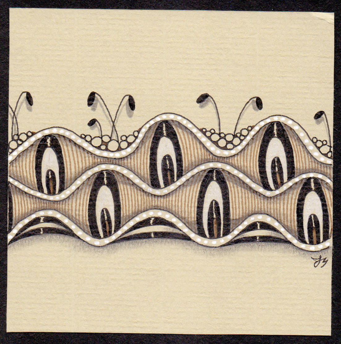 |
| Featuring Pavonia (Angie Shade) plus Fescu and Tipple |
The closest match was a piece of Daler-Rowney Murano pastel paper in a shade called Stone - it's a lovely colour, and the brown ink and white highlights shine, but it's a little colder than the true tan tile. But it allowed me to take my first tentative step !
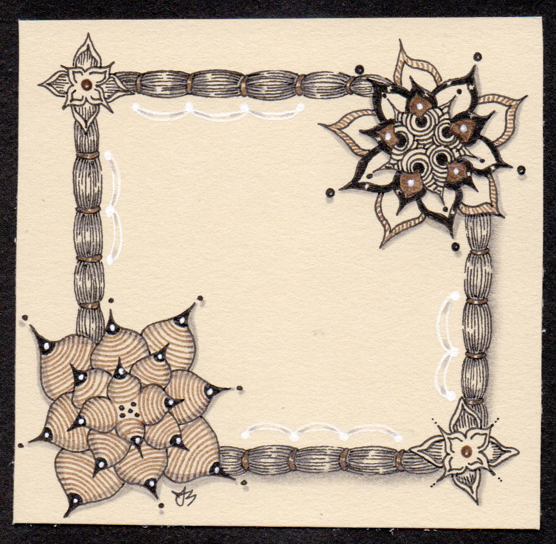 |
| Keeping it official - Cyme tied together with some Zander |
My last experiment was on some Stonehenge 100% cotton paper in a shade called Fawn. This is a very soft and smooth paper, it almost feels buttery, and it encourages me to really slow down. Which suits the Renaissance mood. I feel it asks for different things from me, less filling of the tile perhaps, slower and lighter pen work. Patience. And thoughtful glances ahead to consider where my white highlights might appear. I enjoy the process enormously, and while I still feel most at home in the bold world of black and white this is like spending time in a favourite library. It's peaceful, it's recuperative. The light is low, the mood is easy - hours could be lost, but never regretted.
I thought it was only me! I live in Spain now, the Daler Pastel paper comes at 64 euros a pad! I have spent literally hours traipsing web sites looking for paper the right colour :(Sending over to US for the tiles is out of my league..bit sad. Love your work btw, not just popped in for a moan lol!
ReplyDeleteHello Hilary - feel free to moan. It's tough being a non-US tangler sometimes!
ReplyDeleteI've had a quick think, look, compare for you and here's an idea that might work. https://www.jacksonsart.com/ is a great company, I use them, their prices are good etc. They ship worldwide at reasonable prices. One Daler pastel pad plus shipping to Spain is coming out at 20 Euros. Which is a lot better than you were able to find! And the shipping price might come down if you ordered more. They also do full sheets of that paper that you can cut down yourself, but they come flat packed which might be tricky to send. But the pads are great and I get about 4/6 tiles from each A4 sheet and each pad has 30 sheets. The stone paper is in the Neutrals pad I think. Hope that might help a bit!
One other thought - I just checked Amazon Spain - and they stock the small packs of regular or black tiles - no Renaissance yet, but maybe one day?!
Deletehttps://www.amazon.es/Zentangle-Z20TWGB-Hojas-colorantes-abrecartas/dp/B00W7QIO9E/ref=sr_1_13?s=office&ie=UTF8&qid=1467819227&sr=1-13
Yet another thought - you're going to regret commenting now! I'd be more than happy to send you a few squares of a few of the different colours so you could check out which you prefer using before committing to an order?!
DeleteLol no regrets, it's nice you're interested :) I have indulged in the above also the Strathmore coloured paper(grey and tan)too just love that Z/T tile colour and not keen on the weight and surface of the Strathmore. They have just brought out an artist tile too and the finish is different but no deliveries to Spain.
DeleteEvery now and then I think "oh bum I'll treat myself" lol but can't always afford it.For the Rennaisance though I'll save :D
I've added Jacksons to my list, Cass are great too and pencils4artists have really good prices for...wait for it..pencils etc :) Thank you so much for your help.
ReplyDeleteI haven't used Strathmore paper - but I know what you mean about weight - the Daler paper like the Strathmore weighs only 160gsm - the Stonehenge I mentioned is heavier, 250gsm. But interestingly the official Tan tile is lighter than their white tile.
DeleteThanks for mentioning pencils4artists - that's new to me - I'll bookmark it.
May I ask if you have time to answer a few questions? Perhaps a Facebook page is easier? Please say no if it's not convenient :)
ReplyDeleteOf course I do Hilary. Please look me up on there - I'm Ragged Ray on there. Then feel free to message me or whatever. Ask away!
DeleteI love this post, you have me itching to try more tan shades now, Jem. I have on hand official tan tiles, Strathmore Artists Toned Tan and Toned Gray... and some other pastel paper in the Studio. Kraft as well, of course. I also have a recycled coffee cup paper journal that came from UK's Pink Pig shop!! I'll just have to finish my black tile class plans asap so I can play!!
ReplyDeleteThank you Debbie. I've gained a few more tan-type papers since this post - including the Strathmore ones. As for the Pink Pig's offering... I think you might like my next blog post! ;)
DeleteI'm planning to do a similar post to this about grey tiles when I hit my Winter Inklings!